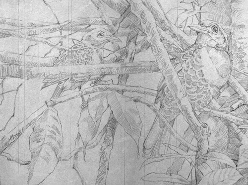
Step One: the basic drawing on toned panel
I had a little epiphany last night while working on my latest bird paintings. Epiphanies don’t come cheap, and so I thought I’d pass this one along.
Value is a big player in the creation of an image. There’s a nice expression my pastel pal uses: color gets the credit, but value does the heavy lifting. I keep that in mind when designing a new painting. The trick is in doing value studies up front.
Value studies can be done with a pencil and paper as a rough approximation of where you’re going, and it can be kept rough and a little ambiguous as a trigger to the imagination. But remember that doing a good value study will help you see what needs strengthening in the composition. It gives you a clue of what should come forward and what should lay back, what should be highlighted, what should be played down. And later on it will help you in your color choices, too.
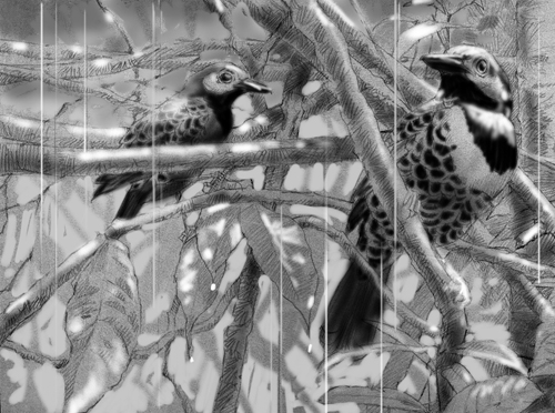
How you do it is up to you. I’m using my Mac more and more to design my artwork before painting it. It’s a great timesaver and it lets you try a lot of things out before putting it in paint (I haven’t tossed out the traditional methods entirely, and can’t imagine I ever will). So here’s a short tutorial for doing value studies in Photoshop, and I bet this works in other graphics programs in some form as well. As an example, I’ll use the painting of the pair of Ocellated antbirds mentioned in an earlier post. It’s now just a pencil drawing on a gessoed board, toned with a mix of burnt sienna and cobalt blue, brushed on and wiped off in two coats. The birds were sketched in the field and redrawn in the studio to make corrections to anatomy; feathering and other details were added. The new drawings were scanned and placed in a Photoshop file along with some background vines I photographed in Central America. When I was happy with the composition (I went through four or five), I used an opaque projector to draw them onto the prepared panel. I scanned the panel and opened it as a grayscale Photoshop file, a file format that allows you to use Layers.
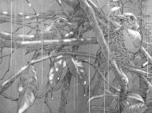
Step 2: Highlights in white
The first thing I did was add a Normal Layer over the image. Think of this as putting a clear overlay on your work, one that can be manipulated and reworked infinitely. Using a soft brush tool I put in the highlights with white (remember, this is grayscale- no colors to distract). This let me see where the light source is, and let me choose what I wanted to make prominant in the composition. Some of the rain streaks are highlighted, while others are not. The raindrips pick up the light and reinforce the feeling of the weather.
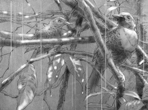
Step 3: Shading forms in gray
On the next Layer I added some shading to give volume to the forms. This was on a Multiply Layer. There’s a pull-down menu where you can designate the type of Layer you want, and there are so many choices it’s fun to play with if you have the time, but for these purposes I’m just using Normal and Multiply. A Multiply Layer is a transparent one, meaning that every color or tone you add is blended with the one below it, increasing and combining the two. If you were to use a Normal Layer, the gray tone would go down opaque and cover the pencil lines,but if you use a gray tone in a Multiply Layer it’s transparent and you can clearly see your drawing underneath.
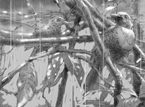
Step 4: Background in mid-tone opaque gray.
I added a Normal Layer next, using it to try out background effects. I also changed brushes, going from the soft airbrush to a hard-edged round brush. I wanted to get the background value going, and I liked it looking a little sketchy and imperfect. In the actual painting I may use visible brushstrokes, too. I used a Normal Layer to get spotty opaque coverage of the background tone and texture that was already there. In the actual painting I might want to let the tone and texture show through, too. This was my way of previewing the effect. It’s crude here, but I can see where it’s going. Note that I left things little darker and more open at the top edge, to keep the background from going too flat.

Step 4: Darkest darks and black added.
Lastly, another Multiply Layer. Going back to the soft Airbrush, I put in the darkest values. Where I wanted it to be really black, I switched back to the hard-edged round brush. I didn’t use a lot of black in this, but it gives an emphasis where it needs it, and really makes the antbirds pop.
If there’s something I want to try while I’m working on the actual painting, I can pull out this file and try things out on the fly. Since I’m on a show deadline, time saved is more time to paint. That’s the biggest value, if you ask me.
Next stop: adding color.
Addendum: 5pm, I’ve gone back into the file and seen something cool to do with the background- erase some of the opaque gray background color to show some of the original tone and texture of the board in leaf-shapes. Now there’s a lot more depth in the background, a sense that something is far behind the birds. Very simple subtraction using the Eraser tool on the Normal Layer with the gray background tone.

I love this!!!! And I agree about Photoshop being a great tool for “real” art. I can mess around in Photoshop and not worry about wasting paper, try different brushes, “paints”, colors… 🙂
Ok, wow. This is one of the most useful tutorials I’ve seen in a while. I’m way too lazy to do value studies, but I think you just convinced me to give it a try next time.
Great tutorial!
Thanks for the comments, and please do give it a try. It worked well for me and I’d love to know if it works for you, too.
I love your posts as they are very insightful and easy to understand. You are a great artist and kind in sharing your knowledge.
very interesting, but I don’t agree with you
Idetrorce
Nice! I like that your taking advantage of the digital program to sort of plan ahead and experiment.